
· 7 min read
Simon Bumm
info

TL;DR: Combining dlt and AWS Lambda creates a secure, scalable, lightweight, and powerful instrumentation engine that Taktile uses for its low-code, high-volume data processing platform. I explain why dlt and AWS Lambda work together so well and how to get everything set up in less than one hour. If you want to jump to the code right away, you can find the accompanying GitHub repo here.

An important aspect of being a data person today is being able to navigate and choose from among many tools when setting up your company’s infrastructure. (And there are many tools out there!). While there is no one-size-fits-all when it comes to the right tooling, choosing ones that are powerful, flexible, and easily compatible with other tools empowers you to tailor your setup to your specific use case.

I am leading Data and Analytics at Taktile: a low-code platform used by global credit- and risk teams to design, build, and evaluate automated decision flows at scale. It’s the leading decision intelligence platform for the financial service industry today. To run our business effectively, we need an instrumentation mechanism that can anonymize and load millions of events and user actions each day into our Snowflake Data Warehouse. Inside the Warehouse, business users will use the data to run product analytics, build financial reports, set up automations, etc.

Taktile Flow Chart

Choosing the right instrumentation engine is non-trivial

Setting up the infrastructure to instrument a secured, high-volume data processing platform like Taktile is complicated and there are essential considerations that need to be made:

  1. Data security: Each day, Taktile processes millions of high-stakes financial decisions for banks and Fintechs around the world. In such an environment, keeping sensitive data safe is crucial. Hence, Taktile only loads a subset of non-sensitive events into its warehouse and cannot rely on external vendors accessing decision data.
  2. Handling irregular traffic volumes: Taktile’s platform is being used for both batch and real-time decision-making, which means that traffic spikes are common and hard to anticipate. Such irregular traffic mandates an instrumentation engine that can quickly scale out and guarantee timely event ingestion into the warehouse, even under high load.
  3. Maintenance: a fast-growing company like Taktile needs to focus on its core product and on tools that don't create additional overhead.

dlt and AWS Lambda as the secure, scalable, and lightweight solution

AWS Lambda is Amazon’s serverless compute service. dlt is a lightweight python ETL library that runs on any infrastructure. dlt fits neatly into the AWS Lambda paradigm, and by just adding a simple REST API and a few lines of python, it converts your Lambda function into a powerful and scalable event ingestion engine.

  • Security: Lambda functions and dlt run within the perimeter of your own AWS infrastructure, hence there are no dependencies on external vendors.
  • Scalability: serverless compute services like AWS Lambda are great at handling traffic volatility through built-in horizontal scaling.
  • Maintenance: not only does AWS Lambda take care of provisioning and managing servers, but inserting dlt into the mix, also adds production-ready capabilities such as:
    • Automatic schema detection and evolution
    • Automatic normalization of unstructured data
    • Easy provisioning of staging destinations

Tools workflow

Get started with dlt on AWS Lambda using SAM (AWS Serverless Application Model)

SAM is a lightweight Infrastructure-As-Code framework provided by AWS. Using SAM, you simply declare serverless resources like Lambda functions, API Gateways, etc. in a template.yml file and deploy them to your AWS account with a lightweight CLI.

  1. Install the SAM CLI [add link or command here]

    pip install aws-sam-cli
  2. Define your resources in a template.yml file

    AWSTemplateFormatVersion: "2010-09-09"
    Transform: AWS::Serverless-2016-10-31

    Resources:
    ApiGateway:
    Type: AWS::Serverless::Api
    Properties:
    Name: DLT Api Gateway
    StageName: v1
    DltFunction:
    Type: AWS::Serverless::Function
    Properties:
    PackageType: Image
    Timeout: 30 # default is 3 seconds, which is usually too little
    MemorySize: 512 # default is 128mb, which is too little
    Events:
    HelloWorldApi:
    Type: Api
    Properties:
    RestApiId: !Ref ApiGateway
    Path: /collect
    Method: POST
    Environment:
    Variables:
    DLT_PROJECT_DIR: "/tmp" # the only writeable directory on a Lambda
    DLT_DATA_DIR: "/tmp" # the only writeable directory on a Lambda
    DLT_PIPELINE_DIR: "/tmp" # the only writeable directory on a Lambda
    Policies:
    - Statement:
    - Sid: AllowDLTSecretAccess
    Effect: Allow
    Action:
    - secretsmanager:GetSecretValue
    Resource: !Sub arn:aws:secretsmanager:${AWS::Region}:${AWS::AccountId}:secret:DLT_*
    Metadata:
    DockerTag: dlt-aws
    DockerContext: .
    Dockerfile: Dockerfile
    Outputs:
    ApiGateway:
    Description: "API Gateway endpoint URL for Staging stage for Hello World function"
    Value: !Sub "https://${ApiGateway}.execute-api.${AWS::Region}.amazonaws.com/v1/collect/"
  3. Build a deployment package

    sam build
  4. Test your setup locally

    sam local start-api

    # in a second terminal window
    curl -X POST http://127.0.0.1:3000/collect -d '{"hello":"world"}'
  5. Deploy your resources to AWS

    sam deploy --stack-name=<your-stack-name> --resolve-image-repos --resolve-s3 --capabilities CAPABILITY_IAM

Caveats to be aware of when setting up dlt on AWS Lambda:

No worries, all caveats described below are already being taken care of in the sample repo: https://github.com/codingcyclist/dlt-aws-lambda. I still recommend you read through them to be aware of what’s going on.

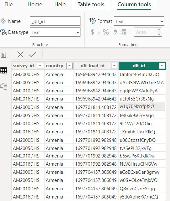
  1. Local files: When running a pipeline, dlt usually stores a schema and other local files under your users’ home directory. On AWS Lambda, however, /tmp is the only directory into which files can be written. Simply tell dlt to use /tmp instead of the home directory by setting the DLT_PROJECT_DIR, DLT_DATA_DIR, DLT_PIPELINE_DIR environment variables to /tmp.
  2. Database Secrets: dlt usually recommends providing database credentials via TOML files or environment variables. However, given that AWS Lambda does not support masking files or environment variables as secrets, I recommend you read database credentials from an external secret manager like AWS Secretsmanager (ASM).
  3. Large dependencies: Usually, the code for a Lambda function gets uploaded as a .zip archive that cannot be larger than 250 MB in total (uncompressed). Given that dbt has a ~400 MB memory footprint (including Snowflake dependencies), the dlt Lambda function needs to be deployed as a Docker image, which can be up to 10 GB in size.

dlt and AWS Lambda are a great foundation for building a production-grade instrumentation engine

dlt and AWS Lambda are a very powerful setup already. At Taktile, we still decided to add a few more components to our production setup to get even better resilience, scalability, and observability:

  1. SQS message queue: An SQS message queue between the API gateway and the Lambda function is useful for three reasons. First, the queue serves as an additional buffer for sudden traffic spikes. Events can just fill the queue until the Lambda function picks them up and loads them into the destination. Second, an SQS queue comes with built-in batching so that the whole setup becomes even more cost-efficient. A batch of events only gets dispatched to the Lambda function when it reaches a certain size or has already been waiting in the queue for a specific period. Third, there is a dead-letter queue attached to make sure no events get dropped, even if the Lambda function fails. Failed events end up in the dead-letter queue and are sent back to the Lambda function once the root cause of the failure has been fixed.
  2. Slack Notifications: Slack messages help a great deal in improving observability when running dlt in production. Taktile has set up Slack notifications for both schema changes and pipeline failures to always have transparency over the health status of their pipeline.

No matter whether you want to save time, cost, or both on your instrumentation setup, I hope you give dlt and AWS Lambda a try. It’s a modern, powerful, and lightweight combination of tools that has served us exceptionally well at Taktile.

· 6 min read
Anuun Chinbat

THE PROBLEM

There are two types of people: those who hoard thousands of unread emails in their inbox and those who open them immediately to avoid the ominous red notification. But one thing unites us all: everyone hates emails. The reasons are clear:

  • They're often unnecessarily wordy, making them time-consuming.
  • SPAM (obviously).
  • They become black holes of lost communication because CC/BCC-ing people doesn't always work.
  • Sometimes, there are just too many.

So, this post will explore a possible remedy to the whole email issue involving AI.


THE SOLUTION

Don't worry; it's nothing overly complex, but it does involve some cool tools that everyone could benefit from.

💡 In a nutshell, I created two flows (a main flow and a subflow) in Kestra :

  • The main flow extracts email data from Gmail and loads it into BigQuery using dlt, checks for new emails, and, if found, triggers the subflow for further processing.
  • The subflow utilizes OpenAI to summarize and analyze the sentiment of an email, loads the results into BigQuery, and then notifies about the details via Slack.

Just so you're aware:

  • Kestra is an open-source automation tool that makes both scheduled and event-driven workflows easy.
  • dlt is an open-source library that you can add to your Python scripts to load data from various and often messy data sources into well-structured, live datasets.
tip

Wanna jump to the GitHub repo?


HOW IT WORKS

To lay it all out clearly: Everything's automated in Kestra, with hassle-free data loading thanks to dlt, and the analytical thinking handled by OpenAI. Here's a diagram to help you understand the general outline of the entire process.

overview

Now, let's delve into specific parts of the implementation.

The environment:

💡 The two flows in Kestra are set up in a very straightforward and intuitive manner. Simply follow the Prerequisites and Setup guidelines in the repo. It should take no more than 15 minutes.

Once you’ve opened http://localhost:8080/ in your browser, this is what you’ll see on your screen:

Kestra

Now, all you need to do is create your flows and execute them.

The great thing about Kestra is its ease of use - it's UI-based, declarative, and language-agnostic. Unless you're using a task like a Python script, you don't even need to know how to code.

tip

If you're already considering ways to use Kestra for your projects, consult their documentation and the plugin pages for further insights.

The data loading part

💡 This is entirely managed by dlt in just five lines of code.

I set up a pipeline using the Inbox source – a regularly tested and verified source from dlt – with BigQuery as the destination.

In my scenario, the email data doesn't have nested structures, so there's no need for flattening. However, if you encounter nested structures in a different use case, dlt can automatically normalize them during loading.

Here's how the pipeline is defined and subsequently run in the first task of the main flow in Kestra:

# Run dlt pipeline to load email data from gmail to BigQuery
pipeline = dlt.pipeline(
pipeline_name="standard_inbox",
destination='bigquery',
dataset_name="messages_data",
full_refresh=False,
)

# Set table name
table_name = "my_inbox"
# Get messages resource from the source
messages = inbox_source(start_date = pendulum.datetime(2023, 11, 15)).messages
# Configure the messages resource to get bodies of the emails
messages = messages(include_body=True).with_name(table_name)
# Load data to the "my_inbox" table
load_info = pipeline.run(messages)

In this setup ☝️, dlt loads all email data into the table “my_inbox”, with the email body specifically stored in the “body” column. After executing your flow in Kestra, the table in BigQuery should appear as shown below:

bigquery_my_inbox

tip

This implementation doesn't handle email attachments, but if you need to analyze, for instance, invoice PDFs from your inbox, you can read about how to automate this with dlt here.

The AI part

💡 In this day and age, how can we not incorporate AI into everything? 😆

But seriously, if you're familiar with OpenAI, it's a matter of an API call to the chat completion endpoint. What simplifies it even further is Kestra’s OpenAI plugin.

In my subflow, I used it to obtain both the summary and sentiment analysis of each email body. Here's a glimpse of how it's implemented:

- id: get_summary
type: io.kestra.plugin.openai.ChatCompletion
apiKey: "{{ secret('OPENAI_API') }}"
model: gpt-3.5-turbo
prompt: "Summarize the email content in one sentence with less than 30 words: {{inputs.data[0]['body']}}"
messages: [{"role": "system", "content": "You are a tool that summarizes emails."}]
info

Kestra also includes Slack, as well as BigQuery plugins, which I used in my flows. Additionally, there is a wide variety of other plugins available.

The automation part

💡 Kestra triggers are the ideal solution!

I’ve used a schedule trigger that allows you to execute your flow on a regular cadence e.g. using a CRON expression:

triggers:
- id: schedule
type: io.kestra.core.models.triggers.types.Schedule
cron: "0 9-18 * * 1-5"

This configuration ensures that your flows are executed hourly on workdays from 9 AM to 6 PM.


THE OUTCOME

A Slack assistant that delivers crisp inbox insights right at your fingertips:

slack.png

And a well-organized table in BigQuery, ready for you to dive into a more complex analysis:

bigquery_test.png

In essence, using Kestra and dlt offers a trio of advantages for refining email analysis and data workflows:

  1. Efficient automation: Kestra effortlessly orchestrates intricate workflows, integrating smoothly with tools like dlt, OpenAI, and BigQuery. This process reduces manual intervention while eliminating errors, and freeing up more time for you.
  2. User-friendly and versatile: Both Kestra and dlt are crafted for ease of use, accommodating a range of skill levels. Their adaptability extends to various use cases.
  3. Seamless scaling: Kestra, powered by Kafka and Elasticsearch, adeptly manages large-scale data and complex workflows. Coupled with dlt's solid data integration capabilities, it ensures a stable and reliable solution for diverse requirements.

HOW IT COULD WORK ELSEWHERE

Basically, you can apply the architecture discussed in this post whenever you need to automate a business process!

For detailed examples of how Kestra can be utilized in various business environments, you can explore Kestra's use cases.

Embrace automation, where the only limit is your imagination! 😛

· 5 min read
Rahul Joshi
info

TL;DR: While most companies continue to build their businesses on top of SAP, when it comes to analytics, they prefer to take advantage of the price and elastic compute of modern cloud infrastructure. As a consequence, we get several dlt users asking for a simple and low-cost way to migrate from SAP to cloud data warehouses like Snowflake. In this blog, I show how you can build a custom SAP connector with dlt and use it to load SAP HANA tables into Snowflake.

Blog image

In case you haven’t figured it out already, we at dltHub love creating blogs and demos. It’s fun, creative, and gives us a chance to play around with many new tools. We are able to do this mostly because, like any other modern tooling, dlt just fits in the modern ecosystem. Not only does dlt have existing integrations (to, for example, GCP, AWS, dbt, airflow etc.) that can simply be “plugged in”, but it is also very simple to customize it to integrate with almost any other modern tool (such as Metabase, Holistics, Dagster, Prefect etc.).

But what about enterprise systems like SAP? They are, after all, the most ubiquitous tooling out there: according to SAP data, 99 out of 100 largest companies are SAP customers. A huge part of the reason for this is that their ERP system is still the gold standard in terms of effectivity and reliability. However, when it comes to OLAP workloads like analytics, machine learning, predictive modelling etc., many companies prefer the convenience and cost savings of modern cloud solutions like GCP, AWS, Azure, etc..

So, wouldn’t it be nice to be able to integrate SAP into the modern ecosystem?

Unfortunately, this is not that simple. SAP does not integrate easily with non-SAP systems, and migrating data out from SAP is complicated and/or costly. This often means that ERP data stays separate from analytics data.

Creating a dlt integration

Our users have been asking for SAP HANA data, hence I decided to create a custom dlt integration to SAP’s in-memory data warehouse: SAP HANA. Given its SQL backend and Python API, I figured dlt should also have no problem connecting to it.

I then use this pipeline to load SAP HANA tables into Snowflake, since Snowflake is cloud agnostic and can be run in different environments (such AWS, GCP, Azure, or any combination of the three). This is how I did it:

Step 1: I created an instance in SAP HANA cloud.

(I used this helpful tutorial to navigate SAP HANA.)

SAP instance

Step 2: I inserted some sample data.
SAP insert data

Step 3: With tables created in SAP HANA, I was now ready to create a dlt pipeline to extract it into Snowflake:

Since SAP HANA has a SQL backend, I decided to extract the data using dlt’s SQL source

  1. I first created a dlt pipeline

    dlt init sql_database snowflake

  2. I then passed the connection string for my HANA instance inside the loading function in sql_database_pipeline.py. (Optional: I also specified the tables that I wanted to load in sql_database().with_resources("v_city", "v_hotel", "room") )

  3. Before running the pipeline I installed all necessary requirements using

    pip install -r requirements.txt

    The dependencies inside requirements.txt are for the general SQL source. To extract data specifically from HANA, I also installed the packages hdbcli and sqlalchemy-hana.

Step 4: I finally ran the pipeline using python sql_database_pipeline.py. This loaded the tables into Snowflake.

Data in Snowflake

Takeaway

The dlt SAP HANA connector constructed in this demo works like any other dlt connector, and is able to successfully load data from SAP HANA into data warehouses like Snowflake.

Furthermore, the demo only used a toy example, but the SQL source is a production-ready source with incremental loading, merges, data contracts etc., which means that this pipeline could also be configured for production use-cases.

Finally, the dlt-SAP integration has bigger consequences: it allows you to add other tools like dbt, airflow etc. easily into an SAP workflow, since all of these tools integrate well with dlt.

Next steps

This was a just first step into exploring what’s possible. Creating a custom dlt connector worked pretty well for SAP HANA, and there are several possible next steps, such as converting this to a verified source, or building other SAP connectors.

  1. Creating a verified source for SAP HANA: This should be pretty straight-forward since it would require a small modification of the existing SQL source.
  2. Creating a dlt connector for SAP S/4 HANA: S/4 HANA is SAP’s ERP software that runs on the HANA database. The use case would be to load ERP tables from S/4 HANA into other data warehouses like Snowflake. Depending on the requirements, there are two ways to go about it:
    1. Low volume data: This would again be straight-forward. SAP offers REST API end points to access ERP tables, and dlt is designed to be able to load data from any such end point.
    2. High volume data: dlt can also be configured for the use case of migrating large volumes of data with fast incremental or merge syncs. But this would require some additional steps, such as configuring the pipeline to access HANA backend directly from Python hdbcli.

· 9 min read
Zaeem Athar
info

TL;DR: In this blog, we'll create a data lineage view for our ingested data by utlizing the dlt load_info.

Why data lineage is important?

Data lineage is an important tool in an arsenal of a data engineer. It showcases the journey of data from its source to its destination. It captures all the pitstops made and can help identify issues in the data pipelines by offering a birds eye view of the data.

As data engineers, data lineage enables us to trace and troubleshoot the datapoints we offer to our stakeholders. It is also an important tool that can be used to meet regulation regarding privacy. Moreover, it can help us evaluate how any changes upstream in a pipeline effects the downstream source. There are many types of data lineage, the most commonly used types are the following:

  • Table lineage, it shows the raw data sources that are used to form a new table. It tracks the flow of data, showing how data moves forward through various processes and transformations.
  • Row lineage reveals the data flow at a more granular level. It refers to tracking and understanding of individual rows of data as they move through various stages in a data processing pipeline. It is a subset of table lineage that focuses specifically on the journey of individual records or rows rather than the entire dataset.
  • Column lineage specifically focuses on tracking and documenting the flow and transformation of individual columns or fields within different tables and views in the data.

Project Overview

In this demo, we showcase how you can leverage the dlt pipeline load_info to create table, row and column lineage for your data. The code for the demo is available on GitHub.

The dlt load_info encapsulates useful information pertaining the loaded data. It contains the pipeline, dataset name, the destination information and list of loaded packages among other elements. Within the load_info packages, you will find a list of all tables and columns created at the destination during loading of the data. It can be used to display all the schema changes that occur during data ingestion and implement data lineage.

We will work with the example of a skate shop that runs an online shop using Shopify, in addition to its physical stores. The data from both sources is extracted using dlt and loaded into BigQuery.

Data Lineage Overview

In order to run analytics workloads, we will create a transformed fact_sales table using dbt and the extracted raw data. The fact_sales table can be used to answer all the sales related queries for the business.

The load_info produced by dlt for both pipelines is also populated into BigQuery. We will use this information to create a Dashboard in Metabase that shows the data lineage for the fact_sales table.

Implementing Data Lineage

To get started install dlt and dbt:

pip install dlt
pip install dbt-bigquery

As we will be ingesting data into BigQuery, we first need to create service account credentials for BigQuery. You can find more info on setting up a service account in the dlt docs.

We use the following CSV files as our data sources for this demo:

dlt provides verified Shopify source to directly extract data from the Shopify API.

Step 1: Initialize a dlt pipeline

To get started we initialize a dlt pipeline and selecting BigQuery as our destination by running the following command:

dlt init data_lineage bigquery

This will create default scaffolding to build our pipeline. Install the dependencies by running the following command:

pip install -r requirements.txt

Loading the data

As a first step, we will load the sales data from the online and physical store of the skate shop into BigQuery. In addition to the sales data, we will also ingest the dlt load_info into BigQuery. This will help us track changes in our pipeline.

Step 2: Adding the dlt pipeline code

In the data_lineage.py file remove the default code and add the following:

FILEPATH = "data/supermarket_sales.csv"
FILEPATH_SHOPIFY = "data/orders_export_1.csv"

class Data_Pipeline:
def __init__(self, pipeline_name, destination, dataset_name):
self.pipeline_name = pipeline_name
self.destination = destination
self.dataset_name = dataset_name

def run_pipeline(self, data, table_name, write_disposition):
# Configure the pipeline with your destination details
pipeline = dlt.pipeline(
pipeline_name=self.pipeline_name,
destination=self.destination,
dataset_name=self.dataset_name
)
# Run the pipeline with the provided data
load_info = pipeline.run(
data,
table_name=table_name,
write_disposition=write_disposition
)

# Pretty print the information on data that was loaded
print(load_info)
return load_info

Any changes in the underlying data are captured by the dlt load_info. To showcase this, we will filter the data to remove the Branch and Tags columns from Store and Shopify data respectively and run the pipeline. Later we will add back the columns and rerun the pipeline. These new columns added will be recorded in the load_info packages.

We will add the load_info back to BigQuery to use in our Dashboard. The Dashboard will provide an overview data lineage for our ingested data.

if __name__ == "__main__":

data_store = pd.read_csv(FILEPATH)
data_shopify = pd.read_csv(FILEPATH_SHOPIFY)

#filtering some data.
select_c_data_store = data_store.loc[
:, data_store.columns.difference(['Branch'])
]
select_c_data_shopify = data_shopify.loc[
:, data_shopify.columns.difference(['Tags'])
]

pipeline_store = Data_Pipeline(
pipeline_name='pipeline_store',
destination='bigquery',
dataset_name='sales_store'
)
pipeline_shopify = Data_Pipeline(
pipeline_name='pipeline_shopify',
destination='bigquery',
dataset_name='sales_shopify'
)

load_a = pipeline_store.run_pipeline(
data=select_c_data_store,
table_name='sales_info',
write_disposition='replace'
)
load_b = pipeline_shopify.run_pipeline(
data=select_c_data_shopify,
table_name='sales_info',
write_disposition='replace'
)

pipeline_store.run_pipeline(
data=load_a.load_packages,
table_name="load_info",
write_disposition="append"
)
pipeline_shopify.run_pipeline(
data=load_b.load_packages,
table_name='load_info',
write_disposition="append"
)

Step 3: Run the dlt pipeline

To run the pipeline, execute the following command:

python data_lineage.py

This will load the data into BigQuery. We now need to remove the column filters from the code and rerun the pipeline. This will add the filtered columns to the tables in BigQuery. The change will be captured by dlt.

Data Transformation and Lineage

Now that both the Shopify and Store data are available in BigQuery, we will use dbt to transform the data.

Step 4: Initialize a dbt project and define model

To get started initialize a dbt project in the root directory:

dbt init sales_dbt

Next, in the sales_dbt/models we define the dbt models. The first model will be the fact_sales.sql. The skate shop has two data sources: the online Shopify source and the physical Store source. We need to combine the data from both sources to create a unified reporting feed. The fact_sales table will be our unified source.

Code for fact_sales.sql:

{{ config(materialized='table') }}

select
invoice_id,
city,
unit_price,
quantity,
total,
date,
payment,
info._dlt_id,
info._dlt_load_id,
loads.schema_name,
loads.inserted_at
from {{source('store', 'sales_info')}} as info
left join {{source('store', '_dlt_loads')}} as loads
on info._dlt_load_id = loads.load_id

union all

select
name as invoice_id,
billing_city,
lineitem_price,
lineitem_quantity,
total,
created_at,
payment_method,
info._dlt_id,
info._dlt_load_id,
loads.schema_name,
loads.inserted_at
from {{source('shopify', 'sales_info')}} as info
left join {{source('shopify', '_dlt_loads')}} as loads
on info._dlt_load_id = loads.load_id
where financial_status = 'paid'

In the query, we join the sales information for each source with its dlt load_info. This will help us keep track of the number of rows added with each pipeline run. The schema_name identifies the source that populated the table and helps establish the table lineage. While the _dlt_load_id identifies the pipeline run that populated the each row and helps establish row level lineage. The sources are combined to create a fact_sales table by doing a union over both sources.

Next, we define the schema_change.sql model to capture the changes in the table schema using a following query:

{{ config(materialized='table') }}

select *
from {{source('store', 'load_info__tables__columns')}}

union all

select *
from {{source('shopify', 'load_info__tables__columns')}}

In the query, we combine the load_info for both sources by doing a union over the sources. The resulting schema_change table contains records of the column changes that occur on each pipeline run. This will help us track the column lineage and will be used to create our Data Lineage Dashboard.

Step 5: Run the dbt package

In the data_lineage.py add the code to run the dbt package using dlt.

pipeline_transform = dlt.pipeline(
pipeline_name='pipeline_transform',
destination='bigquery',
dataset_name='sales_transform'
)

venv = Venv.restore_current()
here = os.path.dirname(os.path.realpath(__file__))

dbt = dlt.dbt.package(
pipeline_transform,
os.path.join(here, "sales_dbt/"),
venv=venv
)

models = dbt.run_all()

for m in models:
print(
f"Model {m.model_name} materialized in {m.time} - "
f"Status {m.status} and message {m.message}"
)

Next, run the pipeline using the following command:

python data_lineage.py

Once the pipeline is run, a new dataset called sales_transform will be created in BigQuery, which will contain the fact_sales and schema_changes tables that we defined in the dbt package.

Step 6: Visualising the lineage in Metabase

To access the BigQuery data in Metabase, we need to connect BigQuery to Metabase. Follow the Metabase docs to connect BigQuery to Metabase.

Once BigQuery is connected with Metabase, use the SQL Editor to create the first table. The Data Load Overview table gives an overview of the dlt pipelines that populated the fact_sales table. It shows the pipeline names and the number of rows loaded into the fact_sales table by each pipeline.

Metabase Report

This can be used to track the rows loaded by each pipeline. An upper and lower threshold can be set, and when our pipelines add rows above or below the threshold, that can act as our canary in the coal mine.

Next, we will visualize the fact_sales and the schema_changes as a table and add the dlt_load_id as a filter. The resulting Data Lineage Dashboard will give us an overview of the table, row and column level lineage for our data.

Data Lineage Dashboard

When we filter by the dlt_load_id the dashboard will filter for the specific pipeline run. In the Fact Sales table the column schema_name identifies the raw sources that populated the table (Table lineage). The table also shows only the rows that were added for the pipeline run (Row Lineage). Lastly, the Updated Columns table revels the columns that were added for filtered pipeline run (Column Lineage).

When we ran the pipeline initially, we filtered out the Tags column and later reintroduced it and ran the pipeline again. The Updated Columns shows that the Tags column was added to the Fact Sales table with the new pipeline run.

Conclusion

Data lineage provides an overview of the data journey from the source to destination. It is an important tool that can help troubleshoot a pipeline. dlt load_info provides an alternative solution to visualizing data lineage by tracking changes in the underlying data.

Although dlt currently does not support data flow diagrams, it tracks changes in the data schema that can be used to create dashboards that provides an overview of table, row and column lineage for the loaded data.

· 8 min read
Aman Gupta

💡 This article explores methods for monitoring transactional events, allowing immediate action and data capture that might be lost otherwise. We focus on Github, Slack, and Hubspot, demonstrating techniques applicable to low-volume transactional events (under 500k/month) within the free tier. For clickstream tracking or higher volumes, we recommend more scalable solutions.

There’s more than one way to sync data. Pulling data after it has been collected from APIs is a classic way, but some types of data are better transmitted as an event at the time of happening. Our approach is event-triggered and can include actions like:

ApplicationAction
SlackSending messages in Slack
GithubCommit, comment, or PR actions
HubspotObject creation or meeting specific criteria

These actions initiate a webhook that sends a POST request to trigger a DLT pipeline for event ingestion. The data is then loaded into BigQuery.

pictorial_demonstration

This setup enables real-time alerts or event storage for later use. For example, let’s say you want to alert every time something happens - you’d want to be able to capture an event being sent to you and act on it. Or, in some cases, you store it for later use. This guide covers a use case for deploying and setting up webhooks.

Why do we use webhooks?

Whenever we want to receive an event from an external source, we need a “recipient address” to which they can send the data. To solve this problem, an effortless way is to use a URL as the address and accept a payload as data.

Why cloud functions?

The key reasons for using cloud functions include:

  1. To have a URL up and accept the data payload, we would need some service or API always to be up and ready to listen for the data.

  2. Creating our application for this would be cumbersome and expensive. It makes sense to use some serverless service for low volumes of events.

  3. On AWS, you would use API gateway + lambda to handle incoming events, but for GCP users, the option is more straightforward: Google Cloud functions come with an HTTP trigger, which enables you to create a URL and accept a payload.

  4. The pricing for cloud functions is unbeatable for low volumes: For ingesting an event with a minor function, assuming processing time to be a few seconds, we could invoke a few hundred thousand calls every month for free. For more pricing details, see the GCP pricing page for cloud functions.

Let's dive into the deployment of webhooks and app setup, focusing next on triggers from GitHub, Slack, and HubSpot for use cases discussed above.

1. GitHub Webhook

This GitHub webhook is triggered upon specified events such as pull requests (PRs), commits, or comments. It relays relevant data to BigQuery. Set up the GitHub webhook by creating the cloud function URL and configuring it in the GitHub repository settings.

1.1 Initialize GitHub webhook deployment

To set up the webhook, start by creating a cloud function. Follow these brief steps, and for an in-depth guide, please refer to the detailed documentation.

  1. Log into GCP and activate the Cloud Functions API.

  2. Click 'Create Function' in Cloud Functions, and select your region and environment setup.

  3. Choose HTTP as the trigger, enable 'Allow unauthenticated invocations', save, and click 'Next'.

  4. Set the environment to Python 3.10 and prepare to insert code into main.py:

    import dlt
    import json
    import time
    from google.cloud import bigquery

    def github_webhook(request):
    # Extract relevant data from the request payload
    data = request.get_json()

    Event = [data]

    pipeline = dlt.pipeline(
    pipeline_name='platform_to_bigquery',
    destination='bigquery',
    dataset_name='github_data',
    )

    pipeline.run(Event, table_name='webhook') #table_name can be customized
    return 'Event received and processed successfully.'
  5. Name the function entry point "github_webhook" and list required modules in requirements.txt.

    # requirements.txt
    dlt[bigquery]
  6. Post-deployment, a webhook URL is generated, typically following a specific format.

    https://{region]-{project-id}.cloudfunctions.net/{cloud-function-name}

Once the cloud function is configured, it provides a URL for GitHub webhooks to send POST requests, funneling data directly into BigQuery.

1.2 Configure the repository webhook in GitHub

Set up a GitHub repository webhook to trigger the cloud function on specified events by following these steps:

  1. Log into GitHub and go to your repository.
  2. Click "Settings" > "Webhooks" > "Add webhook."
  3. Enter the cloud function URL in "Payload URL."
  4. Choose "Content-Type" and select events to trigger the webhook, or select "Just send me everything."
  5. Click "Add webhook."

With these steps complete, any chosen events in the repository will push data to BigQuery, ready for analysis.

2. Slack Webhook

This Slack webhook fires when a user sends a message in a channel where the Slack app is installed. To set it up, set up a cloud function as below and obtain the URL, then configure the message events in Slack App settings.

2.1 Initialize Slack webhook deployment

Set up the webhook by creating a cloud function, using the same steps as for the GitHub webhook.

  1. Here’s what main.py looks like:

    import dlt
    from flask import jsonify

    def slack_webhook(request):
    # Handles webhook POST requests
    if request.method == 'POST':
    data = request.get_json()

    # Responds to Slack's verification challenge
    if 'challenge' in data:
    return jsonify({'challenge': data['challenge']})

    # Processes a message event
    if 'event' in data and 'channel' in data['event']:
    message_data = process_webhook_event(data['event'])

    # Configures and initiates a DLT pipeline
    pipeline = dlt.pipeline(
    pipeline_name='platform_to_bigquery',
    destination='bigquery',
    dataset_name='slack_data',
    )

    # Runs the pipeline with the processed event data
    pipeline.run([message_data], table_name='webhook')
    return 'Event processed.'
    else:
    return 'Event type not supported', 400
    else:
    return 'Only POST requests are accepted', 405

    def process_webhook_event(event_data):
    # Formats the event data for the DLT pipeline
    message_data = {
    'channel': event_data.get('channel'),
    'user': event_data.get('user'),
    'text': event_data.get('text'),
    'ts': event_data.get('ts'),
    # Potentially add more fields according to event_data structure
    }
    return message_data
  2. Name the entry point "slack_webhook" and include the necessary modules in requirements.txt, the same as the GitHub webhook setup.

  3. Once the cloud function is configured, you get a URL for Slack events to send POST requests, funneling data directly into BigQuery.

2.2 Set up and configure a Slack app

Create and install a Slack app in your workspace to link channel messages from Slack to BigQuery as follows:

  1. Go to "Manage apps" in workspace settings; click "Build" and "Create New App".
  2. Choose "from scratch", name the app, select the workspace, and create the app.
  3. Under "Features", select "Event Subscription", enable it, and input the Cloud Function URL.
  4. Add message.channels under "Subscribe to bot events".
  5. Save and integrate the app to the desired channel.

With these steps complete, any message sent on the channel will push data to BigQuery, ready for analysis.

3. Hubspot webhook

A Hubspot webhook can be configured within an automation workflow, applicable to contacts, companies, deals, tickets, quotes, conversations, feedback submissions, goals and invoices. It triggers upon specific conditions or data filters. To establish it, create a cloud function, retrieve its URL, and input this in Hubspot's automation workflow settings for message events.

3.1 Initialize Hubspot webhook deployment

Set up the webhook by creating a cloud function, using the same steps as for the GitHub webhook.

  1. Here’s what main.pylooks like:

    import dlt
    from flask import jsonify

    def hubspot_webhook(request):
    # Endpoint for handling webhook POST requests from Hubspot
    if request.method == 'POST':
    # Get JSON data from the POST request
    data = request.get_json()

    # Initialize and configure the DLT pipeline
    pipeline = dlt.pipeline(
    pipeline_name=ßigquery', # Destination service for the data
    dataset_name='hubspot_webhooks_dataset', # BigQuery dataset name
    )

    # Execute the pipeline with the incoming data
    pipeline.run([data], table_name='hubspot_contact_events')

    # Return a success response
    return jsonify(message='HubSpot event processed.'), 200
    else:
    # Return an error response for non-POST requests
    return jsonify(error='Only POST requests are accepted'), 405

  2. Name the entry point "your_webhook" and include the necessary modules in requirements.txt, the same as the GitHub webhook setup.

  3. Once the cloud function is configured, you get a URL for Slack events to send POST requests, funneling data directly into BigQuery.

3.2 Configure a Hubspot automation workflow

To activate a Hubspot workflow with your webhook:

  1. Go to Hubspot: "Automation" > "Workflows" > "Create workflow".
  2. Start from scratch; choose "Company-based" for this example.
  3. Set "Object created" as the trigger.
  4. Add the "Send a webhook" action, use the "POST" method, and input your webhook URL.
  5. Select the company properties to include, test, and save.

This triggers the webhook upon new company creation, sending data to Bigquery via DLT.

In conclusion

Setting up a webhook is straightforward.

Using dlt with schema evolution, we can accept the events without worrying about their schema. However, for events with custom schemas or vulnerable to bad data quality or abuse, consider using dlt’s data contracts.

· 9 min read
Adrian Brudaru

In a recent article, Anna Geller, product manager at Kestra, highlighted why data ingestion will never be solved. In her article, she described the many obstacles around data ingestion, and detailed how various companies and open-source tools approached this problem.

I’m Adrian, data builder. Before starting dlthub, I was building data warehouses and teams for startups and corporations. Since I was such a power-builder, I have been looking for many years into how this space could be solved.

The conviction on which we started dlt is that, to solve the data ingestion problem, we need to identify the motivated problem solver and turbo charge them with the right tooling.

The current state of data ingestion: dependent on vendors or engineers.

When building a data pipeline, we can start from scratch, or we can look for existing solutions.

How can we build an ingestion pipeline?

  • SaaS tools: We could use ready-made pipelines or use building blocks to configure a new API call.
  • SDKs: We could ask a software developer to build a Singer or Airbyte source. Or we could learn object-oriented programming and the SDKs and become the software developer - but the latter is an unreasonable pathway for most.
  • Custom pipelines: We could ask a data engineer to build custom pipelines. Unfortunately, everyone is building from scratch, so we usually end up reinventing the flat tire. Pipelines often break and have a high maintenance effort, bottlenecking the amount that can be built and maintained per data engineer.

Besides the persona-tool fit, in the current tooling, there is a major trade-off between complexity. For example, SaaS tools or SaaS SDKs offer “building blocks” and leave little room for customizations. On the other hand, custom pipelines enable one to do anything they could want but come with a high burden of code, complexity, and maintenance. And classic SDKs are simply too difficult for the majority of data people.

etl_by_others.png

So how can we solve ingestion?

Ask first, who should solve ingestion. Afterwards, we can look into the right tools.

The builder persona should be invested in solving the problem, not into preserving it.

UI first? We already established that people dependent on a UI with building blocks are non-builders - they use what exists. They are part of the demand, not part of the solution.

SDK first? Further, having a community of software engineers for which the only reason to maintain pipelines is financial incentives also doesn’t work. For example, Singer has a large community of agencies that will help - for a price. But the open-source sources are not maintained, PRs are not accepted, etc. It’s just another indirect vendor community for whom the problem is desired.

The reasonable approach is to offer something to a person who wants to use the data but also has some capability to do something about it, and willingness to make an effort. So the problem has to be solved in code, and it logically follows that if we want the data person to use this without friction, it has to be Python.

So the existing tools are a dead end: What do custom pipeline builders do?

Unfortunately, the industry has very little standardization, but we can note some patterns.

df.to_sql() was a great first step

For the Python-first users, pandas df.to_sql() automated loading dataframes to SQL without having to worry about database-specific commands or APIs.

Unfortunately, this way of loading is limited and not very robust. There is no support for merge/upsert loading or for advanced configuration like performance hints. The automatic typing might sometimes also lead to issues over time with incremental loading.

Additionally, putting the data into a dataframe means loading it into memory, leading to limitations. So a data engineer considering how to create a boilerplate loading solution would not end up relying on this method because it would offer too little while taking away fine-grain control.

So while this method works well for quick and dirty work, it doesn’t work so well in production. And for a data engineer, this method adds little while taking away a lot. The good news: we can all use it; The bad news: it’s not engineering-ready.

Inserting JSON directly is a common antipattern. However, many developers use it because it solves a real problem.

Inserting JSON “as is” is a common antipattern in data loading. We do it because it’s a quick fix for compatibility issues between untyped semi-structured data and strongly typed databases. This enables us to just feed raw data to the analyst who can sort through it and clean it and curate it, which in turn enables the data team to not get bottlenecked at the data engineer.

So, inserting JSON is not all bad. It solves some real problems, but it has some unpleasant side effects:

  • Without an explicit schema, you do not know if there are schema changes in the data.
  • Without an explicit schema, you don’t know if your JSON extract path is unique. Many applications output inconsistent types, for example, a dictionary for a single record or a list of dicts for multiple records, causing JSON path inconsistencies.
  • Without an explicit schema, data discovery and exploration are harder, requiring more effort.
  • Reading a JSON record in a database usually scans the entire record, multiplying cost or degrading performance significantly.
  • Without types, you might incorrectly guess and suffer from frequent maintenance or incorrect parsing.
  • Dashboarding tools usually cannot handle nested data - but they often have options to model tabular data.

Boilerplate code vs one-offs

Companies who have the capacity will generally create some kind of common, boilerplate methods that enable their team to re-use the same glue code. This has major advantages but also disadvantages: building something like this in-house is hard, and the result is often a major cause of frustration for the users. What we usually see implemented is a solution to a problem, but is usually immature to be a nice technology and far from being a good product that people can use.

One-offs have their advantage: they are easy to create and can generally take a shortened path to loading data. However, as soon as you have more of them, you will want to have a single point of maintenance as above.

The solution: A pipeline-building dev tool for the Python layman

Let’s let Drake recap for us:

what would drake do

So what does our desired solution look like?

  • Usable by any Python user in any Python environment, like df.to_sql()
  • Automate difficult things: Normalize JSON into relational tables automatically. Alert schema changes or contract violations. Add robustness, scaling.
  • Keep code low: Declarative hints are better than imperative spaghetti.
  • Enable fine-grained control: Builders should be enabled to control finer aspects such as performance, cost, compliance.
  • Community: Builders should be enabled to share content that they create

We formulated our product principles and went from there.

And how far did we get?

  • dlt is usable by any Python user and has a very shallow learning curve.
  • dlt runs where Python runs: Cloud functions, notebooks, etc.
  • Automate difficult things: Dlt’s schema automations and extraction helpers do 80% of the pipeline work.
  • Keep code low: by automating a large chunk and offering declarative configuration, dlt keeps code as short as it can be.
  • Fine-grained control: Engineers with advanced requirements can easily fulfill them by using building blocks or custom code.
  • Community: We have a sharing mechanism (add a source to dlt’s sources) but it’s too complex for the target audience. There is a trade-off between the quality of code and strictness of requirements which we will continue exploring. We are also considering how LLMs can be used to assist with code quality and pipeline generation in the future.

What about automating the builder further?

LLMs are changing the world. They are particularly well-suited at language tasks. Here, a library shines over any other tool - simple code like you would write with dlt can automatically be written by GPT.

The same cannot be said for SDK code or UI tools: because they use abstractions like classes or configurations, they deviate much further from natural language, significantly increasing the complexity of using LLMs to generate for them.

LLMs aside, technology is advancing faster than our ability to build better interfaces - and a UI builder has been for years an obsolete choice. With the advent of self-documenting APIs following OpenAPI standard, there is no more need for a human to use a UI to compose building blocks - the entire code can be generated even without LLM assistance (demo of how we do it). An LLM could then possibly improve it from there. And if the APIs do not follow the standard, the building blocks of a UI builder are even less useful, while an LLM could read the docs and brute-force solutions.

So, will data ingestion ever be a fully solved problem? Yes, by you and us together.

In summary, data ingestion is a complex challenge that has seen various attempts at solutions, from SDKs to custom pipelines. The landscape is marked by trade-offs, with existing tools often lacking the perfect balance between simplicity and flexibility.

dlt, as a pipeline-building dev tool designed for Python users, aims to bridge this gap by offering an approachable, yet powerful solution. It enables users to automate complex tasks, keep their code concise, and maintain fine-grained control over their data pipelines. The community aspect is also a crucial part of the dlt vision, allowing builders to share their content and insights.

The journey toward solving data ingestion challenges is not just possible; it's promising, and it's one that data professionals together with dlt are uniquely equipped to undertake.

Resources:

· 11 min read
Zaeem Athar
info

TL;DR: In this blog post, we'll build data piplines using dlt and orchestrate them using Dagster.

dlt is an open-source Python library that allows you to declaratively load messy data sources into well-structured tables or datasets, through automatic schema inference and evolution. It simplifies building data pipelines by providing functionality to support the entire extract and load process.

It does so in a scalable way, enabling you to run it on both micro workers or in highly parallelized setups. dlt also offers robustness on extraction by providing state management for incremental extraction, drop-in requests replacement with retries, and many other helpers for common and uncommon extraction cases.

To start with dlt, you can install it using pip: pip install dlt. Afterward, import dlt in your Python script and start building your data pipeline. There's no need to start any backends or containers.

Project Overview:

In this example, we will ingest GitHub issue data from a repository and store the data in BigQuery. We will use dlt to create a data pipeline and orchestrate it using Dagster.

Initially, we will start by creating a simple data pipeline using dlt. We will then orchestrate the pipeline using Dagster. Finally, we will add more features to this pipeline by using the dlt schema evolution and Dagster asset metadata to educate the users about their data pipeline.

The project code is available on GitHub.

Project Overview

As we will be ingesting data into BigQuery we first need to create service account credentials for BigQuery. You can find more info on setting up a service account in the dlt docs.

Once we have the credentials we are ready to begin. Let’s first install Dagster and dlt. The below commands should install both.

pip install dlt
pip install dagster dagster-webserver

Simple dlt Pipeline:

As a first step, we will create the GitHub issues pipeline using dlt.

dlt init github_issues bigquery

This will generate a template for us to create a new pipeline. Under .dlt/secrets.toml add the service account credentials for BigQuery. Then in the github_issues.py delete the generated code and add the following:

@dlt.resource(write_disposition="append")
def github_issues_resource(api_secret_key=dlt.secrets.value):
owner = 'dlt-hub'
repo = 'dlt'
url = f"https://api.github.com/repos/{owner}/{repo}/issues"
headers = {"Accept": "application/vnd.github.raw+json"}

while url:
response = requests.get(url, headers=headers)
response.raise_for_status() # raise exception if invalid response
issues = response.json()
yield issues

if 'link' in response.headers:
if 'rel="next"' not in response.headers['link']:
break

url = response.links['next']['url'] # fetch next page of stargazers
else:
break
time.sleep(2) # sleep for 2 seconds to respect rate limits

if __name__ == "__main__":
# configure the pipeline with your destination details
pipeline = dlt.pipeline(
pipeline_name='github_issues', destination='bigquery', dataset_name='github_issues_data'
)

# run the pipeline with your parameters
load_info = pipeline.run(github_issues_resource())

#print the information on data that was loaded
print(load_info)

The above code creates a simple github_issues pipeline that gets the issues data from the defined repository and loads it into BigQuery. The dlt.resources yields the data while the dlt.pipeline normalizes the nested data and loads it into the defined destination. To read more about the technical details refer to the dlt docs.

To run the pipeline execute the below commands:

pip install -r requirements.txt
python github_issues.py

We now have a running pipeline and are ready to orchestrate it using Dagster.

Orchestrating using Dagster:

We will need to adjust our pipeline a bit to orchestrate it using Dagster.

Step 1: Create a Dagster project

  • Create a new directory for your Dagster project and scaffold the basic structure:
mkdir dagster_github_issues
cd dagster_github_issues
dagster project scaffold --name github-issues

This will generate the default files for Dagster that we will use as a starting point for our data pipeline.

Step 2: Set up the directory structure

  • Inside the github-issues/github_issues directory create the following folders: assets, resources, and dlt.
.
├── README.md
├── github_issues
│ ├── __init__.py
│ ├── assets
│ │ ├── __init__.py
│ ├── dlt
│ │ ├── __init__.py
│ └── resources
│ ├── __init__.py
├── github_issues_tests
│ ├── __init__.py
│ └── test_assets.py
├── pyproject.toml
├── setup.cfg
└── setup.py

Step 3: Add dlt Resources and environment variables

  • Copy the previously created github_issues_resource code into dlt/__init__.py under the dlt folder. Remove the dlt.secrets.value parameter, as we'll pass the credentials through a .env file.
  • Create a .env file in the root directory. This is the directory where the pyproject.toml file exits. Copy the credentials into the .env and follow the correct naming convention. For more info on setting up the .env file have a look at the docs.

Step 4: Add configurable resources and define the asset

  • Define a DltResource class in resources/__init__.py as a Dagster configurable resource. This class allows you to reuse pipeline code inside an asset.
from dagster import ConfigurableResource 
import dlt

class DltResource(ConfigurableResource):
pipeline_name: str
dataset_name: str
destination: str

def create_pipeline(self, resource_data, table_name):

# configure the pipeline with your destination details
pipeline = dlt.pipeline(
pipeline_name=self.pipeline_name, destination=self.destination, dataset_name=self.dataset_name
)

# run the pipeline with your parameters
load_info = pipeline.run(dlt_resource, table_name=table_name)

return load_info
  • Define the asset, issues_pipeline, in assets/__init__.py. This asset uses the configurable resource to create a dlt pipeline and ingests data into BigQuery.
from dagster import asset, get_dagster_logger
from ..resources import DltResource
from ..dlt import github_issues_resource

@asset
def issues_pipeline(pipeline: DltResource):

logger = get_dagster_logger()
results = pipeline.create_pipeline(github_issues_resource, table_name='github_issues')
logger.info(results)

The defined asset (issues_pipeline) takes as input the configurable resource (DltResource). In the asset, we use the configurable resource to create a dlt pipeline by using an instance of the configurable resource (DltResource) to call the create_pipeline function. The dlt.resource (github_issues_resource) is passed to the create_pipeline function. The create_pipeline function normalizes the data and ingests it into BigQuery.

Step 5: Handle Schema Evolution

dlt provides the feature of schema evolution that monitors changes in the defined table schema. Suppose GitHub adds a new column or changes a datatype of a column this small change can break pipelines and transformations. The schema evolution feature works amazingly well with Dagster.

  • Add the schema evolution code to the asset to make our pipelines more resilient to changes.
from dagster import AssetExecutionContext
@asset
def issues_pipeline(context: AssetExecutionContext, pipeline: DltResource):
...
md_content=""
for package in result.load_packages:
for table_name, table in package.schema_update.items():
for column_name, column in table["columns"].items():
md_content= f"\tTable updated: {table_name}: Column changed: {column_name}: {column['data_type']}"

# Attach the Markdown content as metadata to the asset
context.add_output_metadata(metadata={"Updates": MetadataValue.md(md_content)})

Step 6: Define Definitions

  • In the __init.py__ under the github_issues folder add the definitions:
all_assets = load_assets_from_modules([assets])
simple_pipeline = define_asset_job(name="simple_pipeline", selection= ['issues_pipeline'])

defs = Definitions(
assets=all_assets,
jobs=[simple_pipeline],
resources={
"pipeline": DltResource(
pipeline_name = "github_issues",
dataset_name = "dagster_github_issues",
destination = "bigquery",
table_name= "github_issues"
),
}
)

Step 7: Run the Web Server and materialize the asset

  • In the root directory (github-issues) run the dagster dev command to run the web server and materialize the asset.

GitHub Asset

Step 8: View the populated Metadata and ingested data in BigQuery

Once the asset has been successfully materialized go to the Assets tab from the top and select the Issues_pipeline. In the Metadata you can see the Tables, Columns, and Data Types that have been updated. In this case, the changes are related to internal dlt tables.

Any subsequent changes in the GitHub issues schema can be tracked from the metadata. You can set up Slack notifications to be alerted to schema changes.

Meatadata loaded in Asset

Let's finally have a look in BigQuery to view the ingested data.

Data Loaded in Bigquery

The github_issues is the parent table that contains the data from the root level of the JSON returned by the GitHub API. The subsequent table github_issues_assignees is a child table that was nested in the original JSON. dlt normalizes nested data by populating them in separate tables and creates relationships between the tables. To learn more about how dlt created these relationships refer to the docs.

Orchestrating verified dlt source using Dagster:

dlt provides a list of verified sources that can be initialized to fast-track the pipeline-building process. You can find a list of sources provided in the dlt docs.

One of the main strengths of dlt lies in its ability to extract, normalize, and ingest unstructured and semi-structured data from various sources. One of the most commonly used verified source is MongoDB. Let’s quickly look at how we can orchestrate MongoDB source using Dagster.

Step 1: Setting up a Dagster project

  • Start by creating a new Dagster project scaffold:
dagster project scaffold --name mongodb-dlt
  • Follow the steps mentioned earlier and create an assets, and resources directory under mongodb-dlt/mongodb_dlt.
  • Initialize a dlt MongoDB pipeline in the same directory:
dlt init mongodb bigquery

This will create a template with all the necessary logic implemented for extracting data from MongoDB. After running the command your directory structure should be as follows:

.
├── README.md
├── mongodb_dlt
│ ├── __init__.py
│ ├── assets
│ │ ├── __init__.py
│ │ └── assets.py
│ ├── mongodb
│ │ ├── README.md
│ │ ├── __init__.py
│ │ └── helpers.py
│ ├── mongodb_pipeline.py
│ ├── requirements.txt
│ └── resources
│ ├── __init__.py
├── mongodb_dlt_tests
│ ├── __init__.py
│ └── test_assets.py
├── pyproject.toml
├── setup.cfg
└── setup.py

Step 2: Configuring MongoDB Atlas and Credentials

For this example, we are using MongoDB Atlas. Set up the account for MongoDB Atlas and use the test Movie Flix Dataset. You can find detailed information on setting up the credentials in the MongoDB verified sources documentation.

Next, create a .env file and add the BigQuery and MongoDB credentials to the file. The .env file should reside in the root directory.

Step 3: Adding the DltResource

Create a DltResouce under the resources directory. Add the following code to the __init__.py:

from dagster import ConfigurableResource 

import dlt

class DltResource(ConfigurableResource):
pipeline_name: str
dataset_name: str
destination: str

def load_collection(self, resource_data, database):

# configure the pipeline with your destination details
pipeline = dlt.pipeline(
pipeline_name=f"{database}_{self.pipeline_name}", destination=self.destination, dataset_name=f"{self.dataset_name}_{database}"
)

load_info = pipeline.run(resource_data, write_disposition="replace")

return load_info

Step 4: Defining an Asset Factory

The structure of data in MongoDB is such that under each database you will find multiple collections. When writing a data pipeline it is important to separate the data loading for each collection.

Dagster provides the feature of @multi_asset declaration that will allow us to convert each collection under a database into a separate asset. This will make our pipeline easy to debug in case of failure and the collections independent of each other.

In the mongodb_pipeline.py file, locate the load_select_collection_hint_db function. We will use this function to create the asset factory.

In the __init__.py file under the assets directory, define the dlt_asset_factory:

from ..mongodb import mongodb
from ..resources import DltResource

import dlt
import os

URL = os.getenv('SOURCES__MONGODB__CONNECTION__URL')

DATABASE_COLLECTIONS = {
"sample_mflix": [
"comments",
"embedded_movies",
],
}

def dlt_asset_factory(collection_list):
multi_assets = []

for db, collection_name in collection_list.items():
@multi_asset(
name=db,
group_name=db,
outs={
stream: AssetOut(key_prefix=[f'raw_{db}'])
for stream in collection_name}

)
def collections_asset(context: OpExecutionContext, pipeline: DltResource):

# Getting Data From MongoDB
data = mongodb(URL, db).with_resources(*collection_name)

logger = get_dagster_logger()
results = pipeline.load_collection(data, db)
logger.info(results)

return tuple([None for _ in context.selected_output_names])

multi_assets.append(collections_asset)

return multi_assets


dlt_assets = dlt_asset_factory(DATABASE_COLLECTIONS)

Step 5: Definitions and Running the Web Server

Add the definitions in the __init__.py in the root directory:

from dagster import Definitions

from .assets import dlt_assets
from .resources import DltResource

defs = Definitions(
assets=dlt_assets,
resources={
"pipeline": DltResource(
pipeline_name = "mongo",
dataset_name = "dagster_mongo",
destination = "bigquery"
),
}
)

We can run the dagster dev command to start the web server. We can see that each collection is converted into a separate asset by Dagster. We can materialize our assets to ingest the data into BigQuery.

Asset Factory

The resulting data in BigQuery:

Data Ingestion in BigQuery from MongoDB

Conclusion:

In this demo, we looked at how to orchestrate dlt pipelines using Dagster. We started off by creating a simple dlt pipeline and then converted the pipeline into an asset and resource before orchestrating.

We also looked at how we can orchestrate dlt MongoDB verified sources using Dagster. We utilized the Dagster @multi_asset feature to create a dlt_asset_factory which converts each collection under a database to a separate asset allowing us to create more robust data pipelines.

Both dlt and Dagster can be easily run on local machines. By combining the two we can build data pipelines at great speed and rigorously test them before shipping to production.

· 25 min read
Hiba Jamal

cover DeepAI Image with prompt: People stuck with tables.

What’s in this article:

  1. Depending on your role, data modelling can mean different things
  2. Introducing the three dashboarding tools
  3. Introducing our database
  4. Comparison Metrics & Table
  5. In depth comparison

Depending on your role, data modelling can mean different things.

For Data & Analytics Engineers

For some of us who have spent our fair share of time working with databases, the words data model illustrates a bunch of tables on a canvas. Behind those tables we see discussions of whether or not they should be floating there by themselves or tied together by lines that say 1 or * on the corners.

If you are a data engineer, maybe you do a data vault model for ingestion, while if you are an analytics engineer you might do a dimensional model for supporting reporting requirements.

After figuring out what sort of entities, constraints and relationships we need to define, we dive further into the data types of each of the fields within those entities. This makes the recipe for a good data model. This model is then implemented in the database, and deployed to be run against new data coming in. Lastly, to avoid the ill-fated incident of an analyst being lost in the complex structure and pipeline of the data, it must be documented!

For Data Analysts

For the dashboard creators, the initial data model has (hopefully) already been set up. A subset of the tables visualized by the engineers are to be handpicked and dropped onto a dashboard. Some tools do you the favor of detecting relationships between tables, if not, you can find a way to do it on the dashboarding tool itself. The data modelling for analysts includes building aggregated measures, calculated columns, semantic types definition to define the actions the tool allows on the field, and finding the best read, cache and refresh options for the data.

If you have big data, the connected dashboards might be slow and need optimization. This is when you would be pushed to make the decision to fix the problem either before or after it reaches the dashboard. This means creating aggregated tables with a different data granularity, either in the source db or in the tool cache db.

Introducing the three dashboarding tools

The three data reporting or dashboarding tools we’ll be diving into are Power BI, GoodData and Metabase. All three have a substantial following among business intelligence teams and analytics experts, and the tools come with their own set of data modelling capabilities.

Introducing Power BI

Power BI is a powerful data visualization tool trusted by 97% of Fortune 500 companies by 2021. It's available as both desktop and online versions, but being a Microsoft product, it's limited to Windows. You can connect it to various data sources, including files like CSV and JSON, and databases like BigQuery and AWS Athena, and about 40 others! It offers a variety of visual elements for creating reports, and it also supports Python and R integration.

While its primary purpose is generating actionable reports for businesses, it's user-friendly for data exploration and modeling. It's affordable for BI analysts, with pricing ranging from free to $10-$20 per user per month, or premium bundles from $262.80 to $4,995 per month.

Introducing GoodData

GoodData prides itself as the #1 embedded analytics vendor, and currently in 2023, has 3.2 million end users worldwide. Established in 2008, it started with data exploration and visualization tools and has since evolved. In 2022, it introduced its cloud platform with enhanced features (the version referenced in this article). GoodData currently supports 10 data sources and 2 data source managers.

The user-friendly dashboard makes managing data, creating metrics, visuals, and dashboards quite clean and easy. Pricing varies based on the selected product, with both predefined and customizable options to suit an organization's needs.

Introducing Metabase

Metabase is a BI tool that is now about 4 years old, with a user base of almost 50,000 organizations that use it to work with their data. The tool has interesting terms to showcase its abilities to the “data democratization” crowd. For example, while loading visualizations or calculations, it tells you it’s: doing science ✨, which is a playful way to appeal to non-devs. Additionally, if you want to extract SQL-defined data from a source, Metabase calls it 'asking a question' to that source.

This tool serves as a foundation for embedded analytics and offers data organization through model creation and query building. With 26 official data source connectors, it also supports raw data imports. Metabase's pricing varies based on whether it's used as a managed service or self-managed. Self-management can include using it as an open-source tool, and otherwise it has pricing options that extend up to $500, along with custom pricing options.

The dataset we’ll be using for our experiments; modeled by dlt

Our database is based on the data published by LivWell, containing wellness indicators for women all around the world. It can also be found as a flattened CSV on Kaggle, here. It is a compilation of surveys collected from women internationally.

Sample input structure:

[{"survey_id": "AM2000DHS",
"country": "Armenia",
"marriage_related": [{...}, {...}, ...],
"work_related": [{...}, {...}, ...],
"education_related": [{...}, {...}, ...],
"money_related": [{...}, {...}, ...],
"health_related": [{...}, {...}, ...],
"age_related": [{...}, {...}, ...]
},
{...}, {...}, {...}, ...}]

To break it up into proper tables representing the different sections of the surveys, we gave this data to dlt to unpack it into a flat relational structure into BigQuery. dlt automatically unpacked the original data into connected tables. The various child tables link to the parent table wellness using foreign keys. Wellness contains surveys identified by ID and country. The final setup of indicators broken up into different categories can be found below, as displayed by Power BI. This structured database has been used to experiment with all three dashboarding tools in this article.

pbi-modelled-livewell 
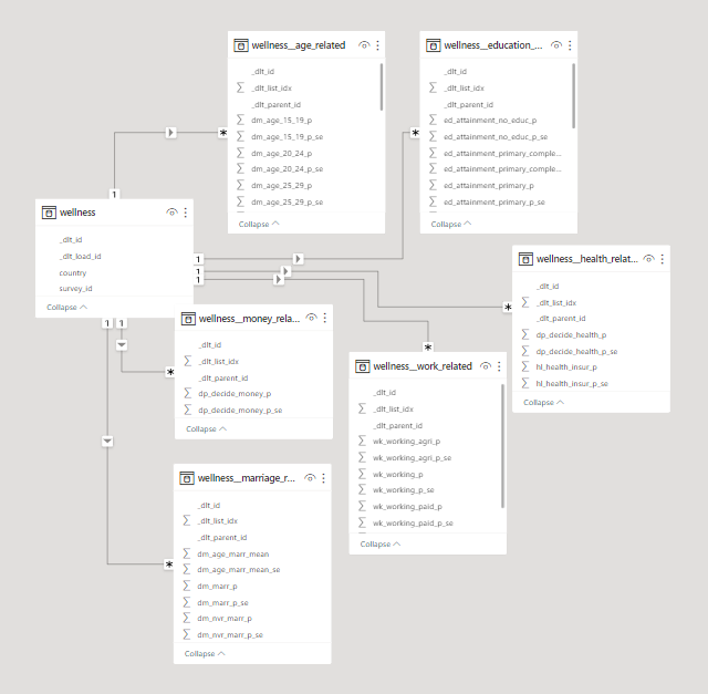
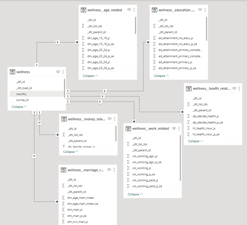
The database schema as presented by a Power BI Model.

Comparison Metrics & Table

The database hosted on BigQuery was loaded into all three dashboarding tools via their own respective connectors. We came up with some metrics to compare things.

Before delving into detailed analyses on those metrics, here's an overview of what'll be discussed:

Power BIGoodDataMetabase
Data TypesIt lets you use types like Decimals, Whole Numbers, Percentages for columns, various date and time formats, and binary objects for conditional setups.GoodData categorizes data as facts, attributes, and tables for efficient organization in a dimensional model.It uses the same data types as the source, such as integers or strings, and also adds user-friendly "field types" for better understanding.
Data DictionariesPower BI allows column property editing but lacks a built-in data dictionary view, accessible via the performance analyzer.GoodData Cloud provides a simplified data dictionary with column properties for easy fact-label categorization, including source data mappings.Metabase has a robust data dictionary in the admin panel, enabling column-level property and description configurations.
Table Properties & DescriptionsPower BI shows table descriptions right under the “Model View” tab, this can be used as a means for table level documentation.GoodData displays table descriptions in the "Data" tab, emphasizing data source mapping over table-level documentation.Metabase provides descriptions through the "Learn about this table" feature, offering insights on the table's significance and important details.
Inter Table Relationships Simplifies data modeling in Model View with drag-and-drop relationships, auto or manual detection, and cardinality editing.GoodData separates date fields into distinct tables, creating a star schema, and automatically identifies keys using source naming conventions.Metabase lets you specify keys at the table level, globally in the admin panel, or within Models and questions, connecting tables through SQL queries or models.
Custom Query language Power BI developers use DAX for measures and fields and Power Query M for data import and transformation.GoodData uses MAQL, a unique query language for multi-dimensional models, unlike traditional SQL for relational databases.Metabase uses SQL for custom models and expressions, seamlessly integrating code with visualizations.
Data granularity Management: Column Creation & Aggregation capabilities Power BI permits the creation of custom fields, and tables, facilitating data granularity adjustments and customized aggregation.Custom calculated fields need the Brick integrator. But, datetime granularity is simplified with custom truncation settings.Like Power BI, it allows users to create models with custom aggregation levels and add custom fields through Custom Expressions.
Defining Local or Central Metrics Power BI Measures can be made in various ways, with DAX for reusable aggregations and has a central "Metrics Hub" in the Power BI service.GoodData uses MAQL for custom metric creation, easily added in the "Analyze" tab. Reusable/central metrics are managed in the Metrics tab.Custom metrics can be crafted through SQL, Questions, Models, and admin-defined metrics can be used in reports with suitable access.
Data Refresh and Loading capabilitiesPower BI data updates vary by loading method: Imported data uses refresh options, while DirectQuery/LiveConnect relies on cache.GoodData has a refresh button for updating source data, with a focus on cache refresh. An automated notification process helps clear old cache data and load the new.Metabase automatically updates data. You can import files for ad hoc analysis and connect dashboards to hosted databases for regular syncing. It has caching abilities too.

In-Depth Comparison

1. Data Types

When designing databases, or even coding in languages that require the “type” of a variable to be declared, we think of data types like int, float, double, char, varchar, string etc. The story becomes slightly different within dashboarding tools.

hard coded dashboard

Power BI

The column types as declared in Power BI in the first image here show that instead of saying double or int, it says Decimal and Whole number. We also have options for visualisation formats such as percentage or different datetime notations. It also has a binary type which is supported in the editor to enable conversion to friendlier types for the end user.

hard coded dashboard

GoodData

While there is a wide range of data types supported in the GoodData pipeline, they are mostly semantic, so relating to their usage not form. It takes all numeric type columns and sets them as facts, the date type columns and creates another table from them, and all text or character based columns and sets them as attributes. This also helps the tool in splitting the columns up into tables in a dimensional model - which will be discussed further in the inter-table relationships section.

hard coded dashboard

Metabase

Interestingly, in Metabase, the data type is defined as it exists in the source, like an integer or string. But, the “field type” isn’t that straightforward; these are not int, float, varchar, or even percentage that we are used to when declaring dashboard columns, but types that are recognizable to any user. These are semantic types, rather than data types. For example, if a column contains numeric data, the categories available to select are Quantity, Price, Cost, Score, etc.

2. Data Dictionaries

In order for an end user to use data, they need to have data literacy. That is the ability to understand what the data they look at actually represents. To enable that, having a data dictionary is a first step. This includes column definitions and the ability to manipulate them, which can be a basic requirement for any dashboard creator.

hard coded dashboard

Power BI

It allows users to edit column level properties on both its main dashboard and on the “Transform Data” window that shows up on the “Model View” tab. This allows you to select the data type of the column, to edit the name, format, and other sorting and aggregation functions you might want to apply to the column. However, this does not have the “data dictionary document” view that one might look for, as one has to click on each column to see its properties. In order to see the proper “data dictionary” document, it can be extracted through Power BI’s performance analyzer.

hard coded dashboard

GoodData

In GoodData Cloud, they increase the level of simplicity to read a data dictionary, and it has only a subset of options presented in the other two tools. The column level properties entail converting the field to a fact or label, or moving the field to another table. It is the only tool here that shows the actual column name and mapping for each column in the logical model as it maps to the data source. This helps us understand which fact and label is matched to which database field in the source data, and how it was perceived under the naming convention in the source. This convention will be discussed more under table relationships.

hard coded dashboard

Metabase

Metabase allows users to view the data dictionary for all tables in the admin panel. This includes setting column properties as well as field settings to be adopted into analytics flows. There are also other aspects to view and change column properties. The first is that after using the little book icon that says “Learn about this table”, we are taken to some documentation that would be available on what that table is (if it was filled in before). After which, we can click on the “Fields in this table” category and that is where the field type of columns can be updated. The second place one we can change the field type is in the meta data of “Questions” or “Models” created. These can be excerpts of data with particular elements of different tables in the selected database. Lastly, Metabase is also the only tool among all, that has the ability to add column level descriptions - that is an amazing level of documentation that one can have available.

3. Table Properties & Descriptions

For an analyst, navigating extensive databases within dashboards can be a challenging endeavor. Ideally, one should be able to discern the purpose of each table by its name alone. While this might be feasible for analysts who were involved in creating and configuring the database, it can be quite perplexing for newcomers to the organization. In such cases, comprehensive documentation becomes an invaluable resource, aiding them in their data exploration journey.

hard coded dashboard

Power BI

All tools show table level descriptions in some shape or form. Power BI shows table descriptions right under the “Model View” tab, this can be used as a means for table level documentation.

hard coded dashboard

GoodData

GoodData on the other hand shows it in the “Data” tab, under “More” > “View” details option on each table. This does not show a documentation level of description for each table as the other two tools. But includes the data source mapping as discussed in the column details section.

hard coded dashboard

Metabase

Metabase shows descriptions and ways to add them in the “Learn about this table” option on each table name, then takes it one step further and adds more information by asking “what makes this table interesting” and “things to be aware of”.

4. Inter Table Relationships

In order to create metrics and visuals that involve data from multiple tables and/or datasets, each dashboarding tool needs to be able to detect or define relationships if they exist.

hard coded dashboard

Power BI

Power BI has one of the most popular setups for data modelling, all contained within its Model View. It has the ability to both auto-detect relationships and the functionality to define them inside the tool in a very easy, drag and drop method. The cardinality for relationships is mostly detected itself even if the relationship is defined, but can also be edited.

hard coded dashboard

GoodData

As for GoodData, the logical modelling layer is quite different than the first two. As discussed in the data types section, and shown in the image, the date type fields are taken and defined as separate tables (or datasets). The reason for doing so is in the spirit of creating a star schema; where one date table serves every table that requires a date dimension. GoodData takes into consideration the star and snowflake schemas as it splits all fields up into facts, labels and attributes. However, as simple as it might be on Power BI to assign primary and foreign keys by drag and drop methods, GoodData requires that fields be names according to a particular convention in the source to be recognized as keys automatically. There is no other way to define them within the tool.

hard coded dashboard

Metabase

For Metabase, a primary or foreign key can be stated as such in the metadata (or field type display/settings) of a table. This can be either be done globally through the admin panel, through field settings in the data dictionary as discussed above, or per visual within Models and questions, through joins. Which means that in order to create a visual out of two or more connected tables, they need to be defined in some sort of SQL Query or Model (if not already connected in the global metadata). There is no ERD level view of table relationships as defined in GoodData and PowerBI.

5. Custom Query Language

When all drag and drop methodologies for defining metrics just aren’t cutting it anymore, one craves SQL and must resort to code. However, different dashboarding tools have different custom query languages.

hard coded dashboard

Power BI

Power BI has two custom languages known to its developers. One of them is DAX - Data Analysis Expression, and the other is Power Query M - Microsoft Power Query. DAX helps to build formulas and easy-to-complex expressions for measures and fields. Power Query is a powerful import defining tool. This can include filtering through one data source while loading it, or combining multiple data sources to your own need. This sets itself apart from other custom query tools as it is helpful during data loading, as compared to metric creation for visuals.

hard coded dashboard

GoodData

GoodData has its own query language called MAQL, or Multi Dimension Analytical Query Language. It is what is used to define metrics, expressions, functions, or other simple or statistical queries. It works on top of the logical data models defined, and hence is aware of the table relationships and dimensions. That is what sets is apart from SQL, which is for relational databases, while MAQL is designed to perform for multi-dimensional models.

hard coded dashboard

Metabase

Metabase sticks to the basics and uses everything SQL! It uses SQL to define custom models and expressions. This includes both writing code to create aggregations and metrics, and the interactive SQL form that they have created. The non-code SQL allows users to do everything one can with SQL, with very well thought-out frontend capabilities. The interwovenness of SQL can be seen when code creates visualizations, and vice versa! Meaning, the aggregations created directly on visualizations can be converted into SQL code - as shown in the image.

6. Data granularity Management: Column Creation & Aggregation capabilities

In foundational database courses, we learn the importance of normalization and how great it is to keep the integrity of your data. However, as we go deeper into normalization levels, the data may become redundant and that is a problem for dashboarding tools, because the data becomes unnecessarily heavy to load. Different tools provide different methods to overcome this problem. That can either look like reducing data granularity, creating custom fields or aggregating tables.

hard coded dashboard

Power BI

Power BI introduces the ability the create custom fields and columns where you might be able to truncate redundant data; like the granularity of time into chunks. On top of which, another table can be built, aggregated on the granularity level you require. This can go beyond chunks of time, into categorizations of any nature, which is a great level of customization that is available in Power BI; the power to make custom calculated fields in the Transform Data section of the tool.

hard coded dashboard

GoodData

However, GoodData requires that if you’d like to add custom calculated fields, that it be done using the integrator Brick - functionalities that are offered by GoodData embedded analytics products, but are so far missing while simply creating a dashboard in the cloud version of the tool. Nonetheless, it helps manage granularity for datetime fields directly by a setting your own custom truncation to them. This can be done so easily by viewing the details on the datetime objects that are cast as a separate table/dataset by GoodData.

hard coded dashboard

Metabase

The same methodology can be followed in Metabase. Where it is easily possible to create Models with your own defined level of aggregation, as well as custom fields that you can introduce to the tables. Custom Fields are created using Custom Expressions in Metabase - which can be done through the query builder.

7. Defining Local or Central Metrics

One of the main responsibilities of BI experts is to track metrics, align them with the company’s expectations, flag them if they go over or under their expected magnitudes. This, according to some data professionals calls for centrally defined definitions that others can use and follow, rather than defining them on their own and possibly misleading analytics flows. The ability to predefine metrics, or aggregations in a dashboard are known as the key abilities of any dashboarding tool! Alongside the ability to simply define these metrics, let’s also explore the ability the define central definitions of metrics as well.

hard coded dashboard

Power BI

In Power BI, these metrics are known as Measures, and can be created from both the fields pane and the calculations view on the Home tab. Either the options given on the Fields pane can be directly utilized to create a metric on a visual, or DAX can be used to create a reusable aggregation as another field under a table. Additionally, the power BI service has a “Metrics Hub”, where users can create metrics and set the scope for which other users can use them.

hard coded dashboard

GoodData

Involving its own query language, GoodData uses MAQL to create custom metrics that can be dragged on to the visuals in the “Analyze” tab easily. This functionality can be found under the Metrics tab, where all metrics can be created and managed. Since these metrics are saved, this can act as a central service to manage and use metrics too!

hard coded dashboard

Metabase

In Metabase, the Summarize functionality serves the same function as aggregated metrics-creation. This can be found after you click on any table in a selected database. Furthermore the functionality for creation of custom metrics can be extended to an SQL query, Metabase Question or Model. Additionally, in the Metabase admin panel, one can create centrally defined metrics as well. These can be adopted into reports that anyone can create, as long as granted the right access!

8. Data Refresh and Loading capabilities

Whether a dashboard is being built for the first time, or is fully furnished but needs to be periodically updated, data loading capabilities of dashboards must be carefully considered for successful reporting. All three tools have very clear methods to add data and support various sources including custom json and csv loaders. How the data can be manipulated after that has been discussed in depth above. We lastly talk about updates.

hard coded dashboard

Power BI

Coming to data updates and refresh capabilities, it depends on how data was loaded onto Power BI. If the data has been imported, then the refresh button and scheduled refresh would work fine to update the dashboards. However, if the loading has been through DirectQuery or LiveConnect, then it does not make sense to add an additional refresh functionality as it does not apply. What does end up being needed is cache availability. Which is provided on Premium offers of the product.

hard coded dashboard

GoodData

GoodData also has a clear refresh button and methodology to refresh sources in the tool. But, unlike Power BI, GoodData refreshes it’s cache as opposed to the entire database. The tool stores computed results and data used in visuals and dashboards in an internal cache. If data is to be refreshed, the cache needs to be refreshed. In this process, it is recommended by GoodData that an automated notification process be set up to clear up the cache from the old data, and load into the new one.

hard coded dashboard

Metabase

As established above, data need only be refreshed if it is stored. Metabase establishes a direct connection to the source, so it doesn’t need a refresh option. Unless the data is a file based import, then Metabase recommends that it be used for ad hoc analysis. As for periodic database syncing, one should rather connect their dashboards to a hosted database. To manage overly frequent refreshes and its impact on dashboards, Metabase offers a Result cache for dashboard charts and a Model cache for modelled data.

· 7 min read
Dylan Hughes & Chris Reuter

This article is reposted from Prefect.io blog, and you can read the original there.

The hardest part about writing a blog is getting started - writing the outline and filling out the first few key points. The same can be said for writing data pipelines: you need to inspect docs, determine data structures, write tests, etc.

What if you could build a resilient, production-ready data pipeline that is scheduled and running in just a few minutes? We’ll show you how to do just that with dlt and Prefect.

dlt

dlt is an open-source library that you can add to your Python scripts to load data from various and often messy data sources into well-structured, live datasets. It abstracts away the need to hunt through docs, interpret APIs, and reinvent the wheel every time. Instead of writing a custom pipeline, you can use dlt to build a framework for your pipelines for any combination of tools.

Moving Slack data into BigQuery

We use BigQuery as our data warehouse, and try to centralize as much information there as possible. Given our Slack community is over 25,000 people, it makes sense to use that information to better our community. We can identify the types of questions our users struggle with the most, and take action to improve Prefect by using Slack data.

If you Google “load Slack into BigQuery,” you’ll see a bunch of listings for no-code tools like Zapier that can help you move data… for a fee, of course. What if you want to do this yourself? Slack has an API, but check it out. It would take some effort to interpret even a simple response like this one for users:

{
"ok": true,
"members": [
{
"id": "W012A3CDE",
"team_id": "T012AB3C4",
"name": "spengler",
"deleted": false,
"color": "9f69e7",
"real_name": "spengler",
"tz": "America/Los_Angeles",
"tz_label": "Pacific Daylight Time",
"tz_offset": -25200,
"profile": {
"avatar_hash": "ge3b51ca72de",
"status_text": "Print is dead",
"status_emoji": ":books:",
"real_name": "Egon Spengler",
"display_name": "spengler",
"real_name_normalized": "Egon Spengler",
"display_name_normalized": "spengler",
"email": "spengler@ghostbusters.example.com",
"image_24": "https://.../avatar/e3b51ca72dee4ef87916ae2b9240df50.jpg",
"image_32": "https://.../avatar/e3b51ca72dee4ef87916ae2b9240df50.jpg",
"image_48": "https://.../avatar/e3b51ca72dee4ef87916ae2b9240df50.jpg",
"image_72": "https://.../avatar/e3b51ca72dee4ef87916ae2b9240df50.jpg",
"image_192": "https://.../avatar/e3b51ca72dee4ef87916ae2b9240df50.jpg",
"image_512": "https://.../avatar/e3b51ca72dee4ef87916ae2b9240df50.jpg",
"team": "T012AB3C4"
},
"is_admin": true,
"is_owner": false,
"is_primary_owner": false,
"is_restricted": false,
"is_ultra_restricted": false,
"is_bot": false,
"updated": 1502138686,
"is_app_user": false,
"has_2fa": false
},
// ... (more data)
]
}

With dlt

You can use dlt to build a Slack to BigQuery pipeline in just a few seconds with a single command. Seriously, it is that simple. In preparation, let’s make sure to install what we need:

pip install dlt
pip install prefect

Then just run a simple init command:


dlt init slack bigquery

In the .dlt/secrets.toml file, enter your Slack and BigQuery credentials:

[sources.slack]
access_token="*****"

[destinations.bigquery]
location = "US"

[destination.bigquery.credentials]
project_id = "*****"
private_key = "*****"
client_email = "*****"

With a single command + adding some credentials, we now have the framework of a pipeline! Look at what has been generated, with a couple of small customizations:

Note that we are redacting some of the code in the preview for brevity, to follow along completely navigate to the repo.

# Pipeline to load Slack into BigQuery

from typing import List

import dlt
import pendulum
from pendulum import datetime

from slack import slack_source

def load_channels() -> None:
"""Execute a pipeline that will load a list of all the Slack channels in the workspace to BigQuery"""
# ...

def get_resources() -> List[str]:
"""Fetch a list of available dlt resources so we can fetch them one at a time"""
# ...

def load_channel_history(channel: str, start_date: datetime) -> None:
"""Execute a pipeline that will load the given Slack channel incrementally beginning at the given start date."""
# ...

def get_users() -> None:
"""Execute a pipeline that will load Slack users list."""
# ...

if __name__ == "__main__":
channels = None
start_date = pendulum.now().subtract(days=1).date()

load_channels()

resources = get_resources()
for resource in resources:
if channels is not None and resource not in channels:
continue

load_channel_history(resource, start_date=start_date)

get_users()

What if it fails?

Great, we’ve got a pipeline that moves data from Slack to BigQuery, and we didn’t have to format any JSON - that alone is a win. However, there may be some issues. What if Slack rate limits you? What if BigQuery is down (😅)? What about a networking issue? What if the execution environment where this script lives isn’t working?

These questions are the difference between a pipeline and a resilient pipeline. They’re the difference between you getting sleep at night and you looking like a hero (or a dummy) to your stakeholders.

Adding Prefect

Prefect is a workflow orchestration tool for turning your pipelines into scheduled, repeatable, and resilient workflows. With Prefect you get scheduling, observability, and automations that can make sure your pipelines aren’t causing you stress in the middle of the night.

Make sure you’re logged in to Prefect Cloud by signing up and using the following command:

prefect cloud login

Luckily, Prefect is also incredibly Pythonic. Turning any pipeline into an observable, scheduled Prefect flow is as simple as adding decorators to your functions and serving it up. Here’s our dlt generated pipeline, scheduled daily:

from typing import List

import dlt
import pendulum
from pendulum import datetime
from prefect import flow, task
from slack import slack_source

@task
def load_channels() -> None:
...

@task
def get_resources() -> List[str]:
...

@task
def load_channel_history(channel: str, start_date: datetime) -> None:
...

@task
def get_users() -> None:
...

@flow
def slack_pipeline(
channels=None, start_date=pendulum.now().subtract(days=1).date()
) -> None:
load_channels()

resources = get_resources()
for resource in resources:
if channels is not None and resource not in channels:
continue

load_channel_history(resource, start_date=start_date)

get_users()

if __name__ == "__main__":
slack_pipeline.serve("slack_pipeline", cron="0 0 * * *")

We’ve added @task to our individual functions. These will be treated as individual units of work by Prefect when they are executed. We decorate our primary function (slack_pipeline) with @flow, which references our task functions. We will schedule and kick off flows, which in turn will execute tasks based on the decorators within them.

Finally, adding .serve to our if __name__ == "__main__": call means that a Prefect deployment will be automatically created and scheduled to run daily at noon. We can see our deployment and scheduled runs in the Prefect UI, and we’ll know when it ran or, more importantly, if they didn't. We can further extend our pipeline by:

Where to handle failure

There are many levels of failure, you could say, from "accidentally liking your ex's social media post from five years ago" to "trying to assemble IKEA furniture without instructions," up to "asking for the Wi-Fi password at a funeral." So which ones should we handle where, and what are some quick solutions?

With dlt, your pipelines are resilient at the API level. From schema changes to network issues or memory overflow, there is automated resiliency and recovery that is specific to working with the pesky APIs of your tools.

With Prefect, your pipelines become resilient at the function level. If your workflows never run, break and fail, or break and never end, Prefect will be your backstop - notifying you and taking the appropriate action in case of failure.

Building resilient pipelines faster with dlt + Prefect

Getting into production is hard. First you need to build your pipeline, and then you need to make it resilient. With this tutorial, we’ve shown you how to quickly build pipelines with dlt and then turn that pipeline into a resilient, repeatable workflow with Prefect.

Prefect makes complex workflows simpler, not harder. Try Prefect Cloud for free for yourself, download our open source package, join our Slack community, or talk to one of our engineers to learn more.

· 12 min read
Hiba Jamal

What’s in this article:

  1. ⌛The Problem; The bulk of time spent in a data science project is on the transformation of data itself.
    1. The usual flow of data for data science projects
    2. A peak into the datasets 👀
  2. ⚰️The Classical Solution; using pandas to model complicated data for your analytics workflows isn’t the fastest way out.
  3. 💫The Revised Solution; Revisualizing the flow of data with dlt & Deepnote
    1. Introducing dlt; the data cleaner I wish I had
    2. Deepnote - the iPython Notebook turned Dashboarding tool
  4. 🌍Clustering countries based on their wellness indicators
  5. 🔧Technical Conclusion; dlt & Deepnote are the data science dream team
  6. 🎆Analytical Conclusion; Leave women in dangerous situations for extended periods of time and they’ll begin to justify the violence committed against themselves!

⌛The Problem; The bulk of time spent in a data science project is on the transformation of data itself.

If you are a data analyst, data scientist or a machine learning engineer, then more likely than not, you spend more time fixing data pipelines or data formats then you do on ML algorithms or dashboard designs. We aren’t always lucky enough to get structured data to work with. Imagine a world where your training data is just this statement without no prior work:

select * from <dataset_table>

What a world that would be.

Unfortunately, before we get to writing this select statement, we need to go through some very important but time consuming first steps. To describe what this journey looks like, let’s list down the steps we usually undergo.

The usual flow of data for data science projects

usual flow

We sign up for our jobs because we enjoy the last two activities the most. These parts have all the pretty charts, the flashy animations, and, if the stars align, include watching your hunches turn out to be statistically significant!

However, the journey to reach these stages is stretched much longer due to the time spent on data formats and pipelines. It would be such a load off my mind if they would get sorted themselves and we could skip to the good part. Sure, ipython notebooks with pandas and numpy help us in getting along, but what if there was something even simpler? Let’s explore different solutions.

A peak into the datasets 👀

The two datasets that we are using are nested json files, with further lists of dictionaries, and are survey results with wellness indicators for women. Here’s what the first element of one dataset looks like:

Looks like it is a nested json, nested further with more lists of dictionaries.

⚰️The Classical Solution; using pandas to model complicated data for your analytics workflows isn’t the fastest way out.

Usually, json_normalize can be used to unnest a json file while loading it into pandas. However, the nested lists inside dictionaries do not unravel quite well. Nonetheless, let’s see how the pandas normalizer works on our dataset.

Conclusion from looking at the data: pandas successfully flattened dictionaries but did not unnest lists. Perhaps because in order to unpack these lists, one might need to create new tables, essentially create a data model entirely. But, that is something pandas does not do for us. So, to be able to use it, let’s flatten the data further into arrays and tables. Particularly, let’s pay attention to the amount of code required to achieve this task.

To start off, using the pandas explode function might be a good way to flatten these lists:

And now, putting one of the nested variables into a pandas data frame:

And this little exercise needs to be repeated for each of the columns that we had to “explode” in the first place.

Our next step could be using a visualization package like matplotlib, and other pandas and numpy based functions to conduct a thorough exploratory analysis on the data. However, if we use the code above and plot two variables against each other on a scatter plot, for example, marriage_related and work_related, then joining this data wouldn’t be simple. We would have to be wary of the list indices (or something that can be used as foreign keys) that will match rows together across different tables. Otherwise, we would end up with mismatched data points on the scatter plot. We’ll get more into this in the Know your data model section.

💫The Revised Solution; Revisualizing the flow of data with dlt & Deepnote

We can reimagine the flow of data with dlt and Deepnote in the following way:

revised flow

We leave the loading of the raw data to dlt, while we leave the data exploration and visualization to the Deepnote interface.

Introducing dlt; the data cleaner I wish I had

Imagine this: you initialize a data pipeline in one line of code, and pass complicated raw data in another to be modelled, unnested and formatted. Now, watch that come to reality:

And that’s pretty much it. Notice the difference in the effort you had to put in?

The data has been loaded into a pipeline with duckdb as its destination. duckdb was chosen as it is an OLAP database, perfect for usage in our analytics workflow. The data has been unnested and formatted. To explore what exactly was stored in that destination, a duckdb connector (conn) is set up, and the SHOW ALL TABLES command is executed.

In a first look, we understand that both the datasets violence and wellness have their own base tables. One of the child tables is shown below:

Know your data model; connect the unnested tables using dlt’s pre-assigned primary and foreign keys:

The child tables, like violence__value or wellness__age_related are the unnested lists of dictionaries from the original json files. The _dlt_id column as shown in the table above serves as a primary key. This will help us in connecting the children tables with ease. The parent_id column in the children tables serve as foreign keys to the base tables. If more then one child table needs to be joined together, we make use of the _dlt_list_idx column;

Deepnote - the iPython Notebook turned Dashboarding tool

Take your average Notebook experience, and combine it with the powers of a collaborative and interactive dashboarding tool and you get Deepnote. Now that we focus on analytics portion of this article, let’s check out how Deepnote helps along the way.

One step visualizations

At this point, we would probably move towards a plt.plot or plt.bar function. However, with Deepnote, the little Visualize button on top of any data frame will help us jump straight to an easy figure. Clicking on the Visualize button takes you to a new cell block, where you can choose your parameters, types of charts, and customization settings in the sidebar. The following chart is built from the joined data frame we defined above.

chart

And a stacked bar chart came into existence! A little note about the query results; the value column corresponds to how much (in %) a person justifies violence against women. An interesting yet disturbing insight from the above plot: in many countries, women condone violence against women as often if not more often than men do!

The next figure slices the data further by gender and demographic. The normalized bar chart is sliced by 2 parameters, gender and demographic. The two colors represent genders. While different widths of the rectangles represent the different demographics, and the different heights represent that demographic’s justification of violence in %. The taller the rectangle, the greater the % average. It tells us that most women think that violence on them is justified for the reasons mentioned, as shown by the fact that the blue rectangles make up more than 50% of respondents who say ‘yes’ to each reason shown on the x-axis. If you hover over the blocks, you will see the gender and demographic represented in each differently sized rectangle, alongside that subset’s percentage of justification of violence.

Let’s examine the differences in women’s responses for two demographic types: employment vs education levels. We can see that the blue rectangles for “employed for cash” vs “employed for kind” don’t really vary in size. However, when we select “higher” vs “no education”, we see that the former is merely a speck when compared to the rectangles for the latter. This comparison between employment and education differences demonstrates that education plays a much larger role in likelihood to influence women’s levels of violence justification.

Let’s look at one last plot created by Deepnote for the other dataset with wellness indicators. The upward moving trend shows us that women are much less likely to have a final say on their health if they are less educated.

🌍 Clustering countries based on their wellness indicators

Lastly, based on these indicators of wellness and violence about women, let’s use KMEANS to cluster these countries to see how the algorithm groups which countries together. The intersection of the ‘countries’ columns in both datasets results in the availability of data for 45 countries. The columns used in this model indicate per country:

  • the average years of education for women

  • % of women who have a final say over their health matters

  • % of women who have control over their finances

  • % of women working

  • % of violence justification

    Within these countries, the KMEANs algorithm converges to 4 clusters.

clustering

The color bar shows us which color is associated to which cluster. Namely; 1: purple, 2: blue, 3: green, and 4: yellow.

To understand briefly what each cluster represents, let’s look at the averages for each indicator across all clusters;

This tells us that according to these datasets, cluster 2 (highlighted blue) is the cluster that is performing the best in terms of wellness of women. It has the lowest levels of justifications of violence, highest average years of education, and almost the highest percentage of women who have control over their health and finances. This is followed by clusters 3, 1, and 4 respectively; countries like the Philippines, Peru, Mozambique, Indonesia and Bolivia are comparatively better than countries like South Africa, Egypt, Zambia, Guatemala & all South Asian countries, in regards to how they treat women.

🔧Technical Conclusion; dlt & Deepnote are the data science dream team

It is safe to say that dlt is a dream come true for all data scientists who do not want to 1. Wait for a data engineer to fix data pipeline issues and model discrepancies, or 2. Spend time studying the format of a dataset and find ways to structure and unnest it. The library supports many different sources and can pick up the dreadful data cleaning tasks you don’t want to do.

Next, let’s talk about the coding tool of choice for this article—Deepnote. With code blocks that come with AI code generation and debugging capabilities, and the built-in ability to use SQL on your Python DataFrame, you can quickly create multiple plots out of a given DataFrame. You can also easily slice your visualizations by various dimensions using Python-based visualization libraries like seaborn, matplotlib and plotly.

Using both of these tools together made the critical tasks of data loading and data exploration much easier for a data scientist or analyst by automating much of the upfront data preparation steps!

🎆Analytical Conclusion; Leave women in dangerous situations for extended periods of time and they’ll begin to justify the violence committed against themselves!

The data we explored in the plots above demonstrated that women often justify violent acts committed against themselves almost as equally as men do. Particularly, women who are less educated are more likely to fall into the shackles of these beliefs when compared to their more educated counterparts.

Additionally, the data also shows us women who are less educated have less input on the fate of their personal health. Thus, misogyny is often internalized and condoned by women themselves, especially by those who are less educated. It is not enough to be kinder toward women—we need to advocate for their education to be able to fight the sexism and prejudice that often start within women themselves.


P.S. If you want to explore this notebook on your own, then here’s the link to it!

This demo works on codespaces. Codespaces is a development environment available for free to anyone with a Github account. You'll be asked to fork the demo repository and from there the README guides you with further steps.
The demo uses the Continue VSCode extension.

Off to codespaces!

DHelp

Ask a question

Welcome to "Codex Central", your next-gen help center, driven by OpenAI's GPT-4 model. It's more than just a forum or a FAQ hub – it's a dynamic knowledge base where coders can find AI-assisted solutions to their pressing problems. With GPT-4's powerful comprehension and predictive abilities, Codex Central provides instantaneous issue resolution, insightful debugging, and personalized guidance. Get your code running smoothly with the unparalleled support at Codex Central - coding help reimagined with AI prowess.